
Brief
The United Nations has requested an 11x17 poster to commemorate the 77th anniversary of the Declaration of Human Rights. They've asked the I pick a specific article from the available 30, and deliver a design that speaks to the spirit of that article.
Article 13: Everyone has the right to freedom of movement.
The Challenge
The challenge was to communicate freedom of movement visually without relying on literal imagery or simply reproducing the language of the article. The poster needed to capture the emotional weight of the principle while remaining immediate, accessible, and visually engaging.
Keywords & Visual Direction
The keywords used to seed this ideation step were: Borders, Everyone, Free, Freedom, State.
Starting with this core set, I wanted to push beyond the obvious by investigating associations and synonyms, then distill them into a well-defined conceptual foundation that explored both expected and unexpected directions.
This process was captured in a mind-map.

Exploration
With a large set of objective keywords, the goal of this step was to create unique pairings and quickly sketch each combination at least once. This allowed me to explore a broad range of conceptual directions before narrowing the ideas down for further development.

Roadblock & Sunrise

Framing & Forward

Roadblock & Floating Balloons
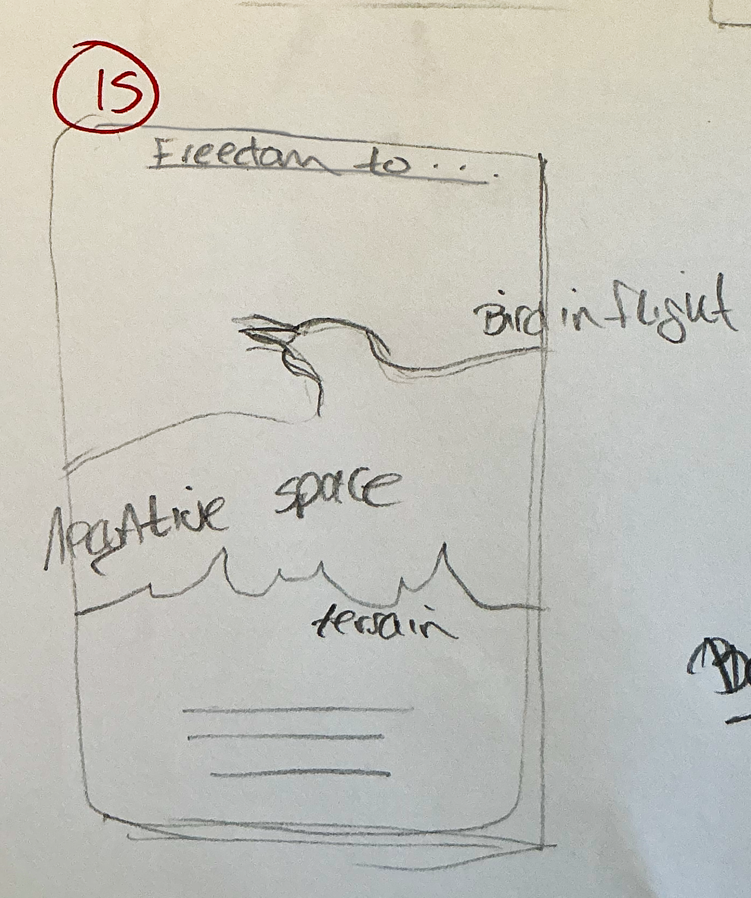
Birds & Horizon
Rough Digitals
Pulling from my rough sketches, I mixed and matched different concepts and tested their viability through rapid digital roughs. This step continued the evolution of small, atomic ideas into larger, more nuanced concepts. Each set explored a distinct direction, allowing me to generate as many possibilities as possible before moving into refinement.
This direction evolved from exploring the associations between Horizon, Roadblock, Sunrise, Terrain, and Forward.

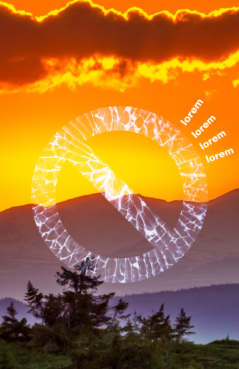

This direction evolved from exploring the associations between Borders, Frames, Freedom, Birds, Travel, and Compass.


This direction evolved from exploring the associations between People, Walls, Open Door.


Refinement
The following two directions were coalesced from directions explored in the digital roughs step.
Candidate 1
Birds have broken free of the compass frame and are flying away to the horizon.
For the display initial idea is to have elegant text inscribed on the housing, but readability is extremely important and wasn’t sure this work.
Inspired by the nautical compass that came up in my research, I’m looking at softer, blue sky colors and ‘lagoonish’ colors with a sandy, orangish feel.


Candidate 2
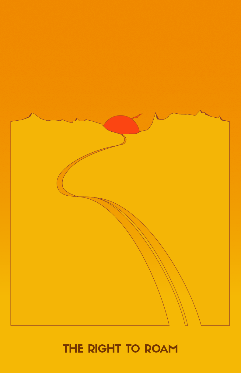
This concept evolved from forward motion that broke through barriers and pushed beyond the horizon. I wanted to push the concept further by exploring ideas with negative space.
The first concept being driven by a stop sign, I had started looking into traffic light colors. When I switched to the final idea I looked into sunset colors.


Final Poster

Takeaway
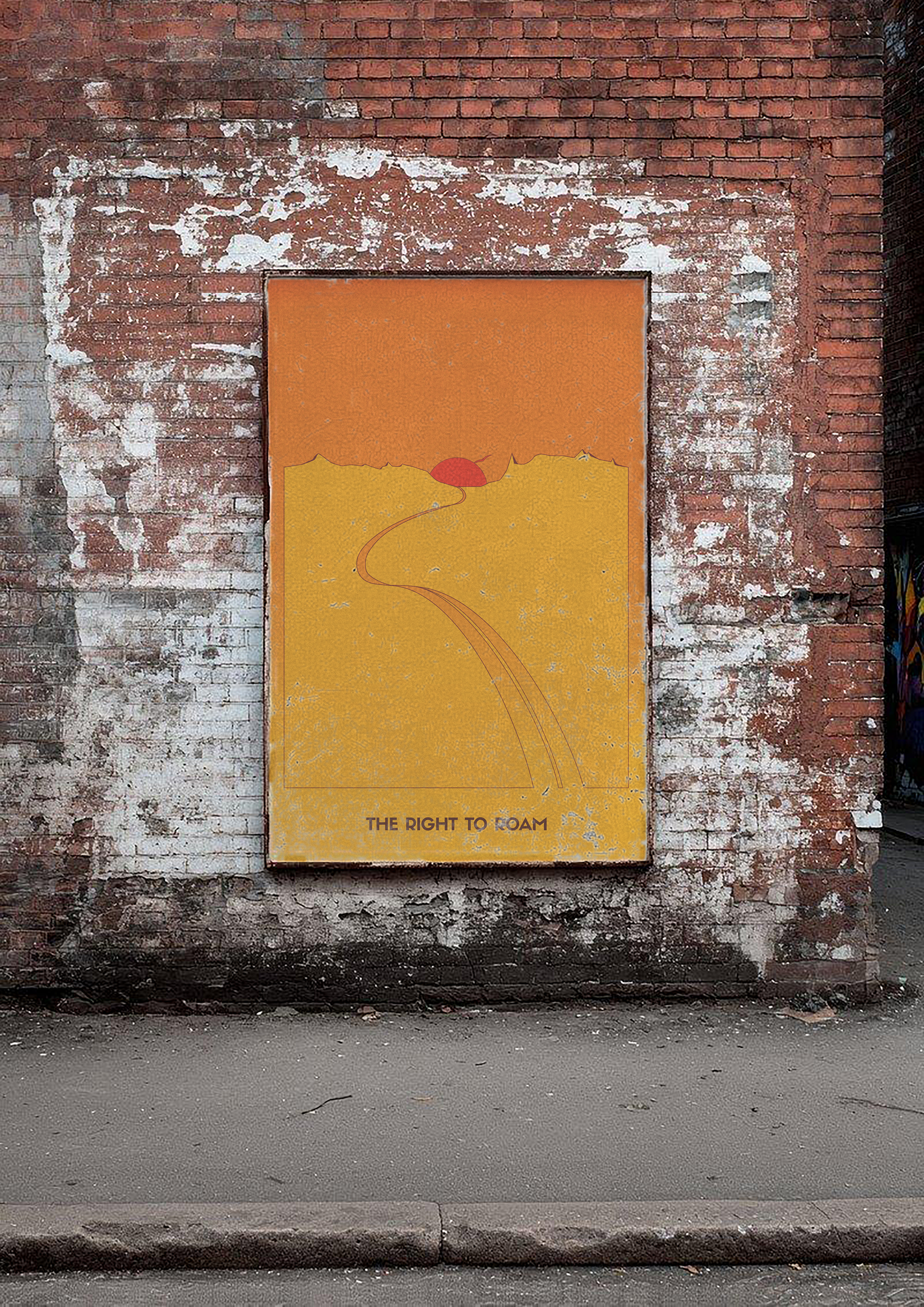
I wanted to draw the eye to the bottom of the composition and place the viewers feet on a road leading to the horizon, with a soaring bird over a rising sun.