
Description
To celebrate the 77th anniversary of the U.N. Declaration of Human Rights, I developed a logo and visual identity system.
The visual direction balances the significance of the Declaration with a celebratory, approachable tone, using expressive typography and an energetic color palette.

Primary Logo
Use the primary logo when the anniversary is the primary focus of the communication, including campaign materials, event branding, digital platforms, and promotional collateral. Preserve the approved proportions, spacing, typography, and color relationships.

Secondary Logo
Use the secondary logo where a more compact version of the identity is required, such as social media, merchandise, banners, email signatures, and presentations. It should complement—not replace—the primary logo in high-visibility applications.

Legibility
Both the primary and secondary logos must follow the established legibility standards, including minimum size, required clear space, and appropriate color contrast, to ensure the identity remains clear, recognizable, and consistent across all applications.

Brand Colors
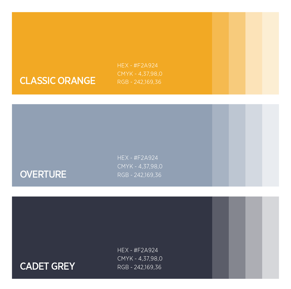
Use approved color combinations consistently across print and digital applications. Maintain sufficient contrast for legibility and accessibility, and do not introduce unapproved colors or gradients.
Ensure sufficient contrast between colors and backgrounds to preserve legibility and accessibility. Do not substitute, alter, or introduce unapproved colors, gradients, or effects that compromise the integrity of the brand identity.
Typography
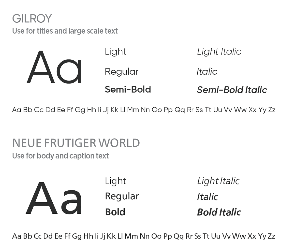
Gilroy is the primary display typeface and should be used for headlines, titles, large- scale messaging, and callouts. Its bold, geometric forms complement the energetic visual identity and create a strong, memorable presence. Use heavier weights for emphasis and maintain consistent spacing to ensure readability.
Neue Frutiger World is the primary text typeface and should be used for body copy, captions, supporting information, and extended content. Its highly legible design provides clarity across print and digital applications, making it ideal for communicating detailed information.
Brand Applications


